- Date
- October 28, 2024
Logo I designed for Swim for Sadie, a program that provides free swimming lessons for children in Harrisonburg, VA.- Date
- January 4, 2024
This is the logo I designed for the Church of the Incarnation Arts Guild. The Arts Guild is a group of artisans across many mediums who meet regularly.- Date
- December 30, 2022
This is the logo I designed for Halcyon Video Games, which is a video game shop located in downtown Harrisonburg, Virginia.- Date
- December 20, 2022
Logo I designed for The Commonwealth Group, a financial management firm based in downtown Harrisonburg, VA- Date
- July 14, 2022
Logo I designed for Ed Therapy 360. Ed Therapy 360 is an educational therapy company run by Susan Micari, M.S. Ed., BCET- Date
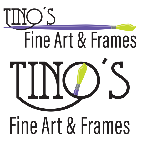
- October 31, 2020
Logo I designed for Tino’s Fine art & Frames, an art gallery and framing shop in sunny Gulfshores, AL.- Date
- April 9, 2019
Heart Path Story Coaching is a business in Harrisonburg, VA that offers a safe space of kindness and compassion in which people can engage with their narratives through mentoring and art journaling.- Date
- February 25, 2019
Mihret Medical Supply facilitates the collection and delivery of medical equipment and medicine worldwide to humanitarian entities.