I’ve done flyer designs and random website updates here and there for Shenandoah Yoga, for years. Earlier in the year, Sue and I talked about doing a major overhaul for her website. I sent her over to the BeTheme site to look and see if any of their theme layouts looked good to her as a starting place. She chose their Yoga layout.
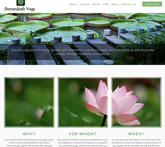
We decided right away that we’d be scaling down on some of the bells and whistles in the demo site. I did LOVE that triptych effect of the three block images on the home page. I went to Shutterstock.com, and chose three images that I felt would compliment her branding colors, and also evoke a sense of calm and zen. I found the perfefct ones in a pink lotus blossum, underside of a lily pad, and a photo of a plank walkway across a tranquil pond.
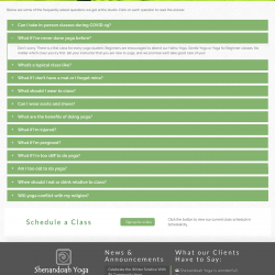
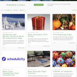
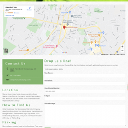
I set about getting the theme colors, fonts, and layout just the way Sue wanted it, as well as making some adjustments along the way. I decided to put her FAQ in accordions, putting the question headers on solid green backgrounds instead of them being just plain text. I also opted for a smaller front page slider rather than a full page slider, and made the header a little larger so that her full logo could be seen better. We added some things like the testimonial slider in the footer, and I also made some adjustments to the theme CSS so that her sticky header is the same size as the regular header.
We’re still going to do a bit of work to put more personal photos of her and Sue and her studio on the site, but the difference between the old site and the new one is really night and day in terms of usability and overall personality. Sue loves it, and so happy client means happy designer.
To view the website, visit https://shenandoahyoga.com.
Project Images
Click any of the images below, to view full size.
